Paper mode
Color Theory to Enhance Your Designs
Leverage the power of color to make your designs stand out and communicate more effectively.
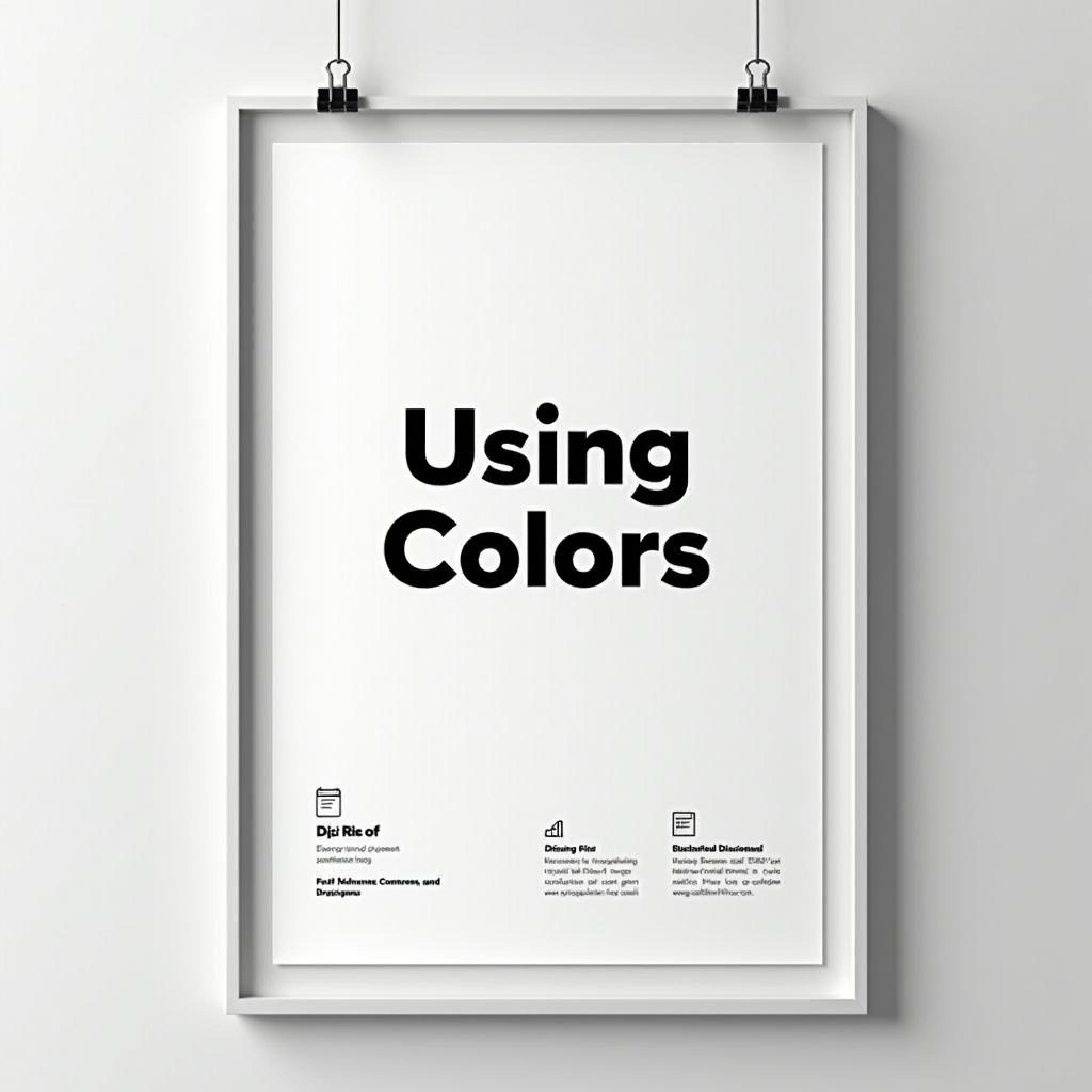
Color is one of the most influential tools in a designer’s toolkit. This blog explores how color theory can be used to evoke emotions, create balance, and enhance the overall visual impact of your designs.
Color is one of the most powerful tools a designer has at their disposal. It can evoke emotions, communicate meaning, and influence how users perceive and interact with a design. Understanding the principles of color theory allows designers to use color strategically, creating harmony, contrast, and balance in their work. Whether you’re designing a website, a logo, or a poster, the right color choices can make a significant impact on the overall effectiveness of the design. At the heart of color theory is the color wheel, a visual representation of primary, secondary, and tertiary colors. The relationships between these colors—such as complementary, analogous, and triadic color schemes—help designers create harmony and balance in their designs. For example, complementary colors, which sit opposite each other on the color wheel, create strong contrast and can be used to highlight key elements. Analogous colors, which sit next to each other, create a more harmonious, soothing effect and are often used in nature-inspired designs. Beyond basic color relationships, designers also need to consider the psychological impact of color. Different colors evoke different emotions and associations, making color an essential part of branding and communication. For example, red is often associated with passion, excitement, and urgency, making it a popular choice for calls to action. Blue, on the other hand, is calming and trustworthy, which is why it’s often used by financial institutions and healthcare providers. Yellow conveys energy and optimism, while green is linked to nature and growth. Color can also be used to create visual hierarchy and guide the viewer’s eye. In web design, for instance, using a bold, contrasting color for buttons or calls to action can draw attention and encourage clicks. Similarly, using lighter or more muted colors for background elements helps the main content stand out. Designers can also use color to group related content, making it easier for users to navigate and understand the information being presented. In addition to understanding color relationships and psychology, designers must also consider accessibility. Not all users perceive color in the same way, and some may have color vision deficiencies. To ensure that your design is accessible to everyone, it’s important to use high-contrast color combinations and provide alternative cues, such as text labels or icons, for important information. Tools like contrast checkers can help you determine whether your color choices meet accessibility standards. Cultural context is another important factor in color theory. Different cultures interpret colors in unique ways, so it’s essential to consider your audience when choosing a color palette. For example, while white is often associated with purity and simplicity in Western cultures, it can symbolize mourning in some Eastern cultures. Red, which is seen as bold and exciting in many Western countries, is a symbol of luck and prosperity in China. Choosing the right color palette requires both creativity and strategy. It’s not just about picking colors that look good together—it’s about creating a visual experience that resonates with your audience, reinforces your message, and enhances the overall design. By understanding color theory and how different colors interact and influence perception, designers can make more informed choices that elevate their work.
More Blogs


Books related to Colour Theory


Paper mode
Color Theory to Enhance Your Designs
Leverage the power of color to make your designs stand out and communicate more effectively.
Color is one of the most influential tools in a designer’s toolkit. This blog explores how color theory can be used to evoke emotions, create balance, and enhance the overall visual impact of your designs.
Color is one of the most powerful tools a designer has at their disposal. It can evoke emotions, communicate meaning, and influence how users perceive and interact with a design. Understanding the principles of color theory allows designers to use color strategically, creating harmony, contrast, and balance in their work. Whether you’re designing a website, a logo, or a poster, the right color choices can make a significant impact on the overall effectiveness of the design. At the heart of color theory is the color wheel, a visual representation of primary, secondary, and tertiary colors. The relationships between these colors—such as complementary, analogous, and triadic color schemes—help designers create harmony and balance in their designs. For example, complementary colors, which sit opposite each other on the color wheel, create strong contrast and can be used to highlight key elements. Analogous colors, which sit next to each other, create a more harmonious, soothing effect and are often used in nature-inspired designs. Beyond basic color relationships, designers also need to consider the psychological impact of color. Different colors evoke different emotions and associations, making color an essential part of branding and communication. For example, red is often associated with passion, excitement, and urgency, making it a popular choice for calls to action. Blue, on the other hand, is calming and trustworthy, which is why it’s often used by financial institutions and healthcare providers. Yellow conveys energy and optimism, while green is linked to nature and growth. Color can also be used to create visual hierarchy and guide the viewer’s eye. In web design, for instance, using a bold, contrasting color for buttons or calls to action can draw attention and encourage clicks. Similarly, using lighter or more muted colors for background elements helps the main content stand out. Designers can also use color to group related content, making it easier for users to navigate and understand the information being presented. In addition to understanding color relationships and psychology, designers must also consider accessibility. Not all users perceive color in the same way, and some may have color vision deficiencies. To ensure that your design is accessible to everyone, it’s important to use high-contrast color combinations and provide alternative cues, such as text labels or icons, for important information. Tools like contrast checkers can help you determine whether your color choices meet accessibility standards. Cultural context is another important factor in color theory. Different cultures interpret colors in unique ways, so it’s essential to consider your audience when choosing a color palette. For example, while white is often associated with purity and simplicity in Western cultures, it can symbolize mourning in some Eastern cultures. Red, which is seen as bold and exciting in many Western countries, is a symbol of luck and prosperity in China. Choosing the right color palette requires both creativity and strategy. It’s not just about picking colors that look good together—it’s about creating a visual experience that resonates with your audience, reinforces your message, and enhances the overall design. By understanding color theory and how different colors interact and influence perception, designers can make more informed choices that elevate their work.
More Blogs
Books related to Colour Theory
Paper mode
Color Theory to Enhance Your Designs
Leverage the power of color to make your designs stand out and communicate more effectively.
Color is one of the most influential tools in a designer’s toolkit. This blog explores how color theory can be used to evoke emotions, create balance, and enhance the overall visual impact of your designs.
Color is one of the most powerful tools a designer has at their disposal. It can evoke emotions, communicate meaning, and influence how users perceive and interact with a design. Understanding the principles of color theory allows designers to use color strategically, creating harmony, contrast, and balance in their work. Whether you’re designing a website, a logo, or a poster, the right color choices can make a significant impact on the overall effectiveness of the design. At the heart of color theory is the color wheel, a visual representation of primary, secondary, and tertiary colors. The relationships between these colors—such as complementary, analogous, and triadic color schemes—help designers create harmony and balance in their designs. For example, complementary colors, which sit opposite each other on the color wheel, create strong contrast and can be used to highlight key elements. Analogous colors, which sit next to each other, create a more harmonious, soothing effect and are often used in nature-inspired designs. Beyond basic color relationships, designers also need to consider the psychological impact of color. Different colors evoke different emotions and associations, making color an essential part of branding and communication. For example, red is often associated with passion, excitement, and urgency, making it a popular choice for calls to action. Blue, on the other hand, is calming and trustworthy, which is why it’s often used by financial institutions and healthcare providers. Yellow conveys energy and optimism, while green is linked to nature and growth. Color can also be used to create visual hierarchy and guide the viewer’s eye. In web design, for instance, using a bold, contrasting color for buttons or calls to action can draw attention and encourage clicks. Similarly, using lighter or more muted colors for background elements helps the main content stand out. Designers can also use color to group related content, making it easier for users to navigate and understand the information being presented. In addition to understanding color relationships and psychology, designers must also consider accessibility. Not all users perceive color in the same way, and some may have color vision deficiencies. To ensure that your design is accessible to everyone, it’s important to use high-contrast color combinations and provide alternative cues, such as text labels or icons, for important information. Tools like contrast checkers can help you determine whether your color choices meet accessibility standards. Cultural context is another important factor in color theory. Different cultures interpret colors in unique ways, so it’s essential to consider your audience when choosing a color palette. For example, while white is often associated with purity and simplicity in Western cultures, it can symbolize mourning in some Eastern cultures. Red, which is seen as bold and exciting in many Western countries, is a symbol of luck and prosperity in China. Choosing the right color palette requires both creativity and strategy. It’s not just about picking colors that look good together—it’s about creating a visual experience that resonates with your audience, reinforces your message, and enhances the overall design. By understanding color theory and how different colors interact and influence perception, designers can make more informed choices that elevate their work.