Paper mode
Creating Mobile-Friendly Designs
Craft seamless mobile experiences with these essential mobile design strategies.
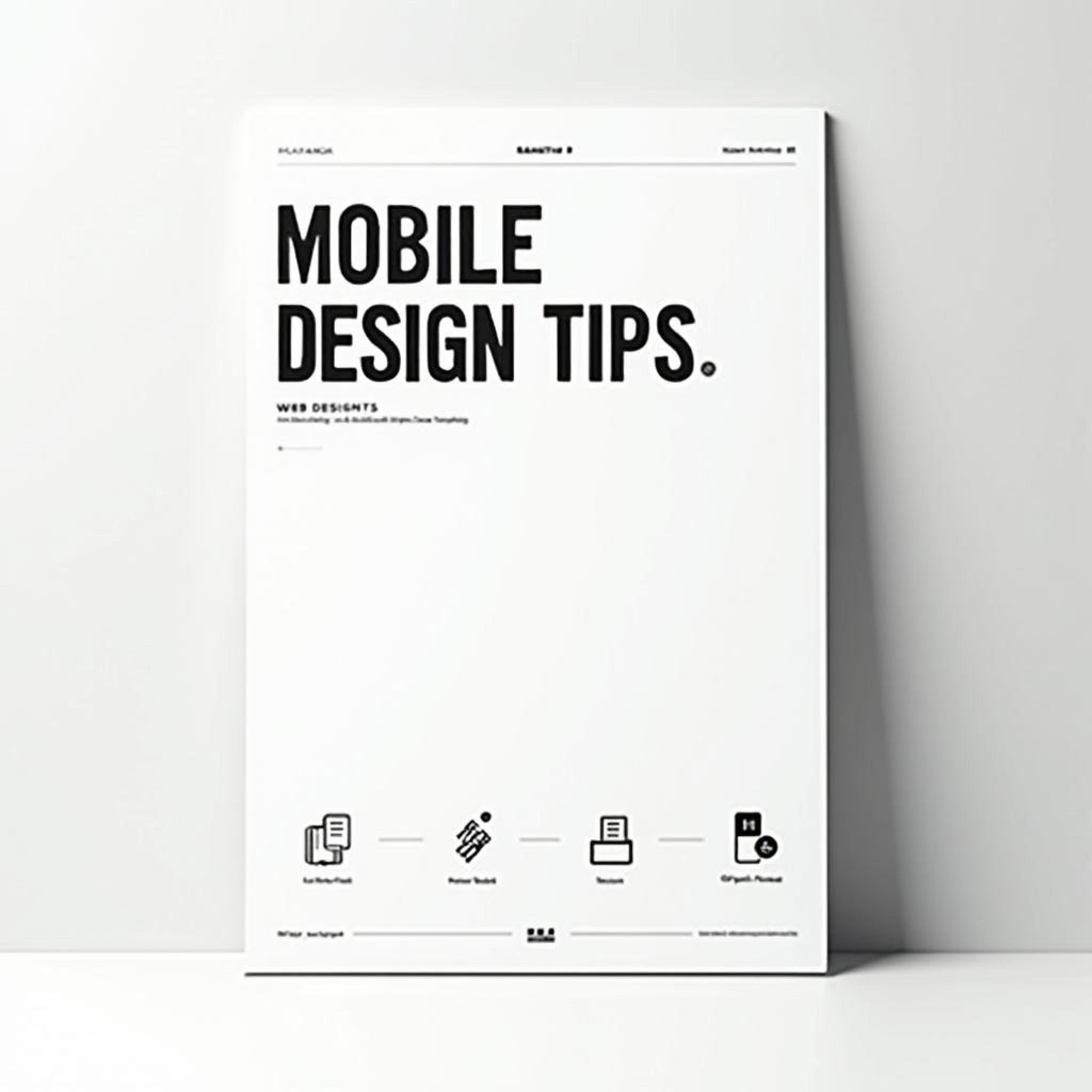
Mobile design is now a crucial part of every designer’s skill set. This blog covers the best practices for creating mobile-friendly designs, from responsive layouts to touch-friendly interfaces.
In today’s digital landscape, mobile devices account for a significant portion of web traffic, making mobile design a top priority for any business. Designing for mobile isn’t just about scaling down a desktop website—it requires a unique approach that considers the limitations and opportunities of smaller screens. Mobile design focuses on creating an experience that is seamless, intuitive, and optimized for touch interactions. This shift to a mobile-first mindset has transformed how designers think about layout, navigation, and user interaction. One of the first principles of mobile design is simplicity. Since mobile screens are smaller than desktops, designers must prioritize the most important information and features, stripping away any unnecessary elements. A clean, minimalistic design not only improves usability but also helps ensure that users aren’t overwhelmed with too much content at once. This often involves focusing on one task or action per screen, such as filling out a form, reading an article, or making a purchase. Touch interactions are another key consideration in mobile design. Unlike desktop users who navigate with a mouse and keyboard, mobile users interact with touchscreens, which means buttons, links, and interactive elements must be large enough to tap easily. Spacing between elements is also crucial—placing buttons or links too close together can lead to frustration when users accidentally tap the wrong thing. Designers must also account for different hand sizes and how users hold their devices, ensuring that common actions are within reach of the thumb. Responsive design is essential for mobile devices. While mobile-first design focuses on creating an experience tailored to mobile users, it’s equally important to ensure that the design adapts to different screen sizes and orientations. A responsive layout automatically adjusts to fit the screen, whether it’s a small smartphone, a larger tablet, or even a desktop. This flexibility allows designers to create a cohesive experience across all devices, without having to build separate designs for each one. Performance is another critical factor in mobile design. Mobile users often have slower internet connections than desktop users, so it’s important to optimize the website for fast loading times. This can be achieved by compressing images, minimizing code, and reducing the number of elements on each page. A slow, laggy website will quickly drive users away, especially on mobile, where attention spans are often shorter. Navigation is also a key challenge in mobile design. Traditional navigation bars or side menus used on desktop websites don’t always translate well to smaller screens. Many mobile designs incorporate hidden menus, such as hamburger menus or dropdowns, to save space while still providing easy access to different sections of the website. Designers must ensure that navigation is intuitive and accessible, with clear labels and logical groupings of content. Another important aspect of mobile design is readability. Text on mobile screens needs to be legible without requiring users to zoom in. This means using larger font sizes, clear contrast between text and background, and sufficient line spacing to prevent the text from feeling cramped. Designers should also limit the amount of text on each screen, breaking content into smaller chunks or using bullet points to make it easier to scan. Ultimately, mobile design is about creating a user experience that feels natural and effortless on smaller devices. By focusing on simplicity, touch interactions, performance, and readability, designers can craft mobile interfaces that engage users and keep them coming back.
More Blogs


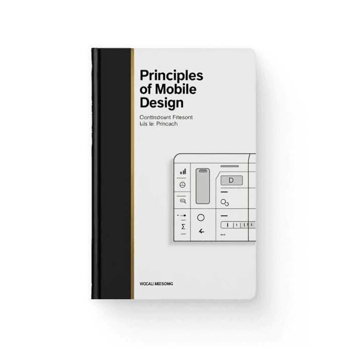
Books related to Mobile Design


Paper mode
Creating Mobile-Friendly Designs
Craft seamless mobile experiences with these essential mobile design strategies.
Mobile design is now a crucial part of every designer’s skill set. This blog covers the best practices for creating mobile-friendly designs, from responsive layouts to touch-friendly interfaces.
In today’s digital landscape, mobile devices account for a significant portion of web traffic, making mobile design a top priority for any business. Designing for mobile isn’t just about scaling down a desktop website—it requires a unique approach that considers the limitations and opportunities of smaller screens. Mobile design focuses on creating an experience that is seamless, intuitive, and optimized for touch interactions. This shift to a mobile-first mindset has transformed how designers think about layout, navigation, and user interaction. One of the first principles of mobile design is simplicity. Since mobile screens are smaller than desktops, designers must prioritize the most important information and features, stripping away any unnecessary elements. A clean, minimalistic design not only improves usability but also helps ensure that users aren’t overwhelmed with too much content at once. This often involves focusing on one task or action per screen, such as filling out a form, reading an article, or making a purchase. Touch interactions are another key consideration in mobile design. Unlike desktop users who navigate with a mouse and keyboard, mobile users interact with touchscreens, which means buttons, links, and interactive elements must be large enough to tap easily. Spacing between elements is also crucial—placing buttons or links too close together can lead to frustration when users accidentally tap the wrong thing. Designers must also account for different hand sizes and how users hold their devices, ensuring that common actions are within reach of the thumb. Responsive design is essential for mobile devices. While mobile-first design focuses on creating an experience tailored to mobile users, it’s equally important to ensure that the design adapts to different screen sizes and orientations. A responsive layout automatically adjusts to fit the screen, whether it’s a small smartphone, a larger tablet, or even a desktop. This flexibility allows designers to create a cohesive experience across all devices, without having to build separate designs for each one. Performance is another critical factor in mobile design. Mobile users often have slower internet connections than desktop users, so it’s important to optimize the website for fast loading times. This can be achieved by compressing images, minimizing code, and reducing the number of elements on each page. A slow, laggy website will quickly drive users away, especially on mobile, where attention spans are often shorter. Navigation is also a key challenge in mobile design. Traditional navigation bars or side menus used on desktop websites don’t always translate well to smaller screens. Many mobile designs incorporate hidden menus, such as hamburger menus or dropdowns, to save space while still providing easy access to different sections of the website. Designers must ensure that navigation is intuitive and accessible, with clear labels and logical groupings of content. Another important aspect of mobile design is readability. Text on mobile screens needs to be legible without requiring users to zoom in. This means using larger font sizes, clear contrast between text and background, and sufficient line spacing to prevent the text from feeling cramped. Designers should also limit the amount of text on each screen, breaking content into smaller chunks or using bullet points to make it easier to scan. Ultimately, mobile design is about creating a user experience that feels natural and effortless on smaller devices. By focusing on simplicity, touch interactions, performance, and readability, designers can craft mobile interfaces that engage users and keep them coming back.
More Blogs
Books related to Mobile Design
Paper mode
Creating Mobile-Friendly Designs
Craft seamless mobile experiences with these essential mobile design strategies.
Mobile design is now a crucial part of every designer’s skill set. This blog covers the best practices for creating mobile-friendly designs, from responsive layouts to touch-friendly interfaces.
In today’s digital landscape, mobile devices account for a significant portion of web traffic, making mobile design a top priority for any business. Designing for mobile isn’t just about scaling down a desktop website—it requires a unique approach that considers the limitations and opportunities of smaller screens. Mobile design focuses on creating an experience that is seamless, intuitive, and optimized for touch interactions. This shift to a mobile-first mindset has transformed how designers think about layout, navigation, and user interaction. One of the first principles of mobile design is simplicity. Since mobile screens are smaller than desktops, designers must prioritize the most important information and features, stripping away any unnecessary elements. A clean, minimalistic design not only improves usability but also helps ensure that users aren’t overwhelmed with too much content at once. This often involves focusing on one task or action per screen, such as filling out a form, reading an article, or making a purchase. Touch interactions are another key consideration in mobile design. Unlike desktop users who navigate with a mouse and keyboard, mobile users interact with touchscreens, which means buttons, links, and interactive elements must be large enough to tap easily. Spacing between elements is also crucial—placing buttons or links too close together can lead to frustration when users accidentally tap the wrong thing. Designers must also account for different hand sizes and how users hold their devices, ensuring that common actions are within reach of the thumb. Responsive design is essential for mobile devices. While mobile-first design focuses on creating an experience tailored to mobile users, it’s equally important to ensure that the design adapts to different screen sizes and orientations. A responsive layout automatically adjusts to fit the screen, whether it’s a small smartphone, a larger tablet, or even a desktop. This flexibility allows designers to create a cohesive experience across all devices, without having to build separate designs for each one. Performance is another critical factor in mobile design. Mobile users often have slower internet connections than desktop users, so it’s important to optimize the website for fast loading times. This can be achieved by compressing images, minimizing code, and reducing the number of elements on each page. A slow, laggy website will quickly drive users away, especially on mobile, where attention spans are often shorter. Navigation is also a key challenge in mobile design. Traditional navigation bars or side menus used on desktop websites don’t always translate well to smaller screens. Many mobile designs incorporate hidden menus, such as hamburger menus or dropdowns, to save space while still providing easy access to different sections of the website. Designers must ensure that navigation is intuitive and accessible, with clear labels and logical groupings of content. Another important aspect of mobile design is readability. Text on mobile screens needs to be legible without requiring users to zoom in. This means using larger font sizes, clear contrast between text and background, and sufficient line spacing to prevent the text from feeling cramped. Designers should also limit the amount of text on each screen, breaking content into smaller chunks or using bullet points to make it easier to scan. Ultimately, mobile design is about creating a user experience that feels natural and effortless on smaller devices. By focusing on simplicity, touch interactions, performance, and readability, designers can craft mobile interfaces that engage users and keep them coming back.